How One Landing Page Accidentally Drove 300k Emails (And The 3 Pages You Should Build)
Table of contents
In 2014, Tim Ferriss logged into Aweber and discovered a 300k email list he never knew existed - thanks to a landing page he’d built years ago. Since then, he’s poured incredible energy and fantastic content into his email newsletter to the point that this is now his primary way of communicating with readers. But let’s go back to the beginning. In 2006, Tim Ferriss built a landing page for his first book - fourhourworkweek.com. In the years that followed, that site generally just sat there unchanged while the real action happened on his blog and on social media. Then as the reach of social media and RSS began to drop due to algorithmic changes, Tim suddenly remembered his old landing page. The 2006 landing page wasn’t great - lots of distractions with email signup just thrown in alongside about 11 other calls to action (CTAs). But it worked well enough to collect 300k emails in 8 years.[1. Tim Ferriss Rethinks Email] 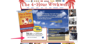 Now that he’s focused on email as a primary strategy, Tim has completely redesigned the landing page to focus almost entirely on email (though there are still a few distracting links that could be improved).
 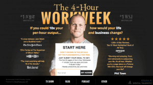 So if a half-way decent landing page can accidentally drive 300k email signups, just imagine what can be done with a good landing page. Let’s dive into some of the most powerful landing page types you should be using.
#1 Homepage
Which page on your website gets the most traffic? Which page is the most cluttered with various calls to action? The homepage. Here’s a core principle of landing pages: No single page can effectively promote more than one call to action. (tweet this) Ever notice how Amazon removes all header content as soon as you enter checkout? Studies have shown ecommerce companies lose droves of customers after entering checkout[2. Why Online Retailers Are Losing 67.45% of Sales and What to Do About It], so Amazon wisely tries to minimize that loss by removing any unnecessary links that will encourage you to do anything other than the desired action on each page (enter shipping address, add payment info, submit order). Of course, they’re even happier if you setup one-click purchasing and avoid the whole leaky funnel to start with. Given a homepage’s role as traffic director, sometimes it is necessary to include more than one call to action (just as Tim’s homepage focuses on email signup but also includes blog links), but it will always impact your conversion rate. 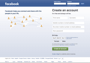 Facebook has nearly 2 billion monthly active users, yet they’ve kept the same boring, simple signed-out homepage for years. It works - 90% of the page is a one step registration form for new users (primary CTA), a small header lets current users sign in, and a small footer provides other relevant links like Messenger app. One of my favorite parts of this page is the “sign up” link in the far left of the footer. Just in case someone missed the massive form filling their screen, Facebook includes a link to a second signup page. Decide the most important CTA for your homepage and remove or minimize everything else.
#2 Signup pages
Depending on your marketing focus, this could be your email signup page, your social follow page, your “sign up for a consultation” page, or even your new user registration page. Whatever your main goal is for new visitors, you should have a dedicated page to be shared in guest posts, comarketing partnerships, paid media, and links across your own website. Side note: I don’t currently have a dedicated landing page for email subscription to Buck Fifty MBA. But you can still sign up by clicking here. ;) 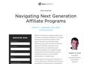 KISSmetrics has found webinars convert visitors into leads quite effectively, so they tend to promote webinars heavily on the popular KISSmetrics blog[1. How KISSmetrics used landing pages to generate $13,000 in sales opportunities per webinar]. Initially, KISSmetrics simply sent webinar clicks to the default GoToWebinar landing page, and they were disappointed to find only 4-6% of people who already clicked through to the signup page actually signed up. So Nemo at KISSmetrics used Unbounce to build a custom landing page - which boosted their signup rates to 40-80%[2. How KISSmetrics Increased Webinar Sign-Up Rates by 1,000%]. Even with an eight question form, this custom page is able to convert more than 10x better than the default. If you take a look at the landing page for January’s webinar, you’ll notice there are literally four links on the entire page: time zone converter (opens in new tab), privacy policy, terms of use, and the signup button. Nothing unnecessary to distract from the primary focus. As nice as it is, I’d probably experiment with a couple changes:
- Adjust the layout so the “RSVP me!” button is above the fold
- Move the note confirming registrants will receive recording even if they can’t attend to the header to catch those folks before they leave
- Make the legal policies in the footer open in new tabs
- Try to make the form shorter - maybe combine first and last name into one field?
#3. Microsites
So if a single page focused on one CTA is good, what about an entire website focused on one CTA? Generally these work best for a specific campaign (e.g., contest, social media campaign) or product (e.g., new car model, movie release). Something that’s big enough to deserve a focused effort, but not big enough to replace whatever’s on your main website. 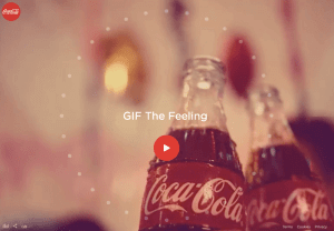 Coca-Cola had an interesting example built solely for their “Taste the Feeling” campaign on social media. Coca-Cola knows they’re selling a feeling, not a drink, so the campaign focuses on “branding” - that ethereal term big companies like to use which in this case translates to “social media shares”. So with the goal of getting users to share branded gifs on social media, Coca-Cola built a dedicated website complete with sound and fullscreen video that let visitors chose from 32 gifs, overlay their message, and share on social. I’m not a huge fan of the core idea - couldn’t they come up with something more original or interesting? - but the execution was strong. Upon reaching the website, users immediately are focused on one CTA - watching the intro video which autoplays in fullscreen. Once that’s finished, you’re guided directly into the gif creation tool and then to sharing. Throughout the process, only a few links distract visitors: one bundle of mandatory links (privacy, terms, cookies) all of which open in new windows and one bundle of useful links (sound control, language setting, and an extra sharing button. The two things I like best about this site are (1) the end-to-end focus on one CTA per page and (2) the ubiquitous sharing icon in the footer. If you want your users to do something, don’t be afraid to give them more than one path to the goal! Of course plenty could also be improved - for instance the fullscreen video intro include shots of the gif tool which prompted me to try to interact with the video. And I’m not sure whether the automatic sound is a clever twist or something that should have been left in the 2000s.
Bonus: More Landing Pages Is Better
What’s even better than a page focused on one call to action? How about a page focused on one CTA for one target audience? Segmentation is a critical part of conversion optimization - we can’t assume one landing page will be perfect for all customers. 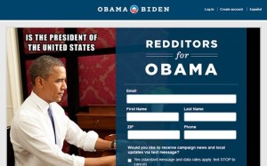 For instance, if you know you’ll be getting a lot of visitors from one particular source, invest the time in building a custom landing page that they will enjoy. During President Obama’s second campaign in 2012, he did a 30 minute “ask me anything” on Reddit. Recognizing the massive amount of interest that would draw, his campaign staff built a custom landing page just for Reddit[2. 5 Email Marketing Lessons From The Obama Campaign]. Similarly, we love to talk about how Dropbox leveraged a viral video to gain initial traction, but that’s not quite right. The video was quite popular, but with very specific audiences: Reddit and Digg users. Rather than try to make a video “everyone” would love, Drew designed one specially filled with easter eggs he know people on Reddit and Digg would recognize and appreciate. You can’t make the perfect landing page for everyone, but you can make the perfect landing pages for everyone.